Rethinking how working professionals discover and enrol in short courses — from first click to sign-up.
Overview
UNSW is one of Australia's leading universities. Alongside their undergraduate and postgraduate programs, they offer a short course catalogue aimed at working professionals — people looking to upskill, change careers, or explore something new.
The short course website existed. But it wasn't working hard enough for the people using it. My team of three was tasked with redesigning the experience from the ground up, running a complete UX process across two weeks.
The Challenge
Finding and enrolling in a short course sounds simple. In practice, it rarely is. People come to this kind of site at a moment of transition — a career change, a skills gap, a "what's next?" — and if the experience is confusing or hard to navigate, they don't convert. They leave.
We needed to understand what those users actually needed, where the current site was letting them down, and how to design something that would serve both the user's journey and UNSW's business goals.
Research
We started with two parallel tracks: the business side and the user side.
Stakeholder interview We interviewed the UNSW manager responsible for the short course offering to understand his perspective on the site's performance and what outcomes mattered most to the business. This surfaced three core business goals that anchored our design decisions throughout the project.
User interviews We conducted interviews with six participants to understand their motivations and experience around course searching and career transitions. A few things came through consistently: people wanted to find relevant courses quickly, they cared about practical details (price, location, time commitment, reviews) being visible without having to dig, and many were navigating the site during an uncertain or stressful period in their career. That emotional context mattered.
Usability testing on the existing site We ran usability testing on the current UNSW short course website and identified three significant usability issues — primarily around navigation structure, course discoverability, and the amount of effort required to get to the information people actually needed.
A note on participants: Finding the right usability testing participants within a two-week sprint was genuinely difficult. We worked with what we had — Academy XI students and LinkedIn connections — which was a limitation worth naming. Anyone considering a career change or upskilling counts as a valid user for this context, and we were transparent about the sample when presenting findings.
Card sorting To inform the information architecture, we ran a card sorting exercise — asking participants to organise course topics into categories and label the groups themselves. This gave us real insight into how people mentally organise learning areas, rather than how UNSW had decided to structure them internally. It directly shaped how we categorised courses in the redesign.
Design
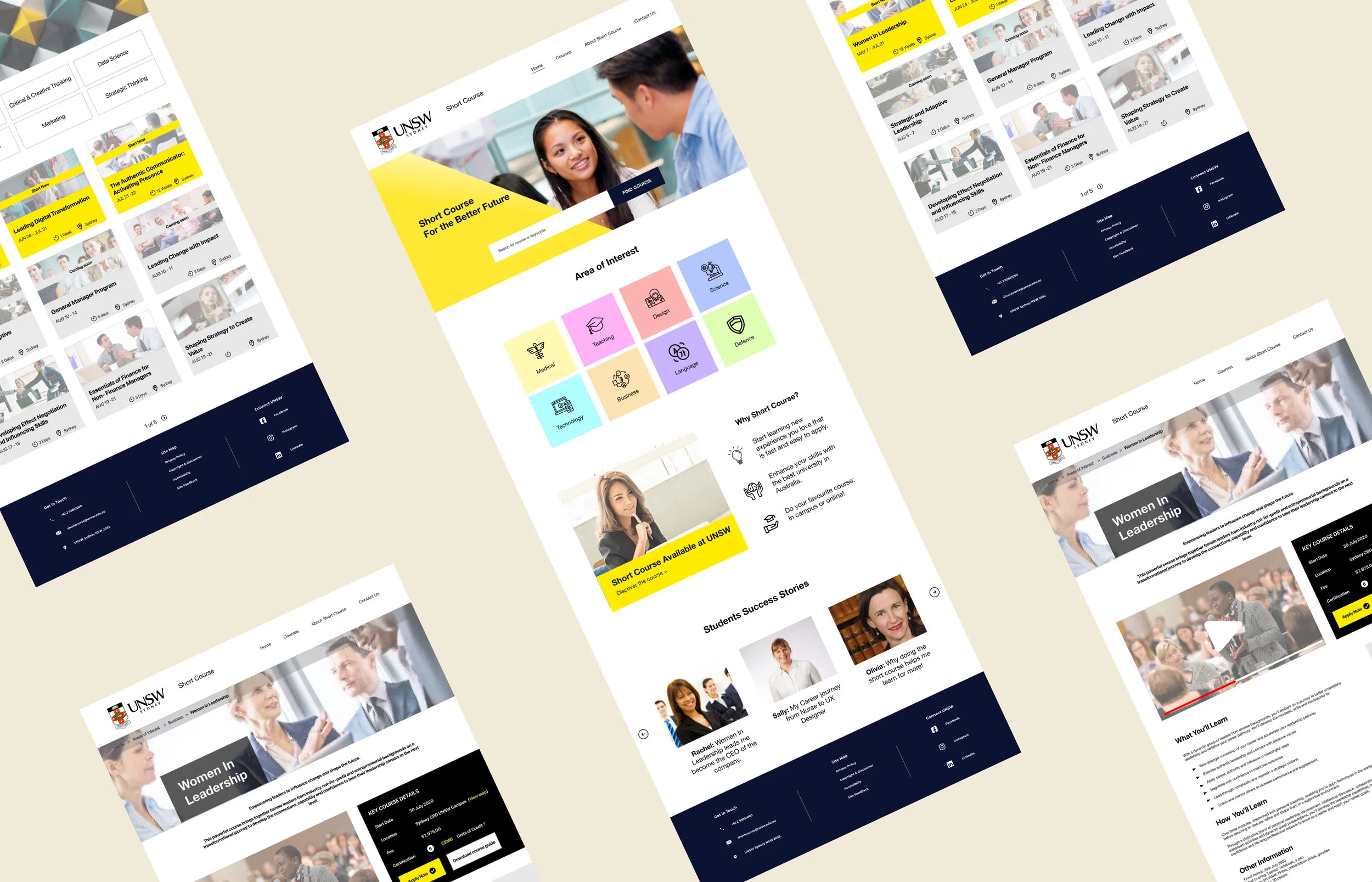
Prominent, functional search Course search was the primary entry point for most users, so we made the search bar impossible to miss on the landing page. Usability testing on the redesign confirmed this — participants immediately knew where to start.
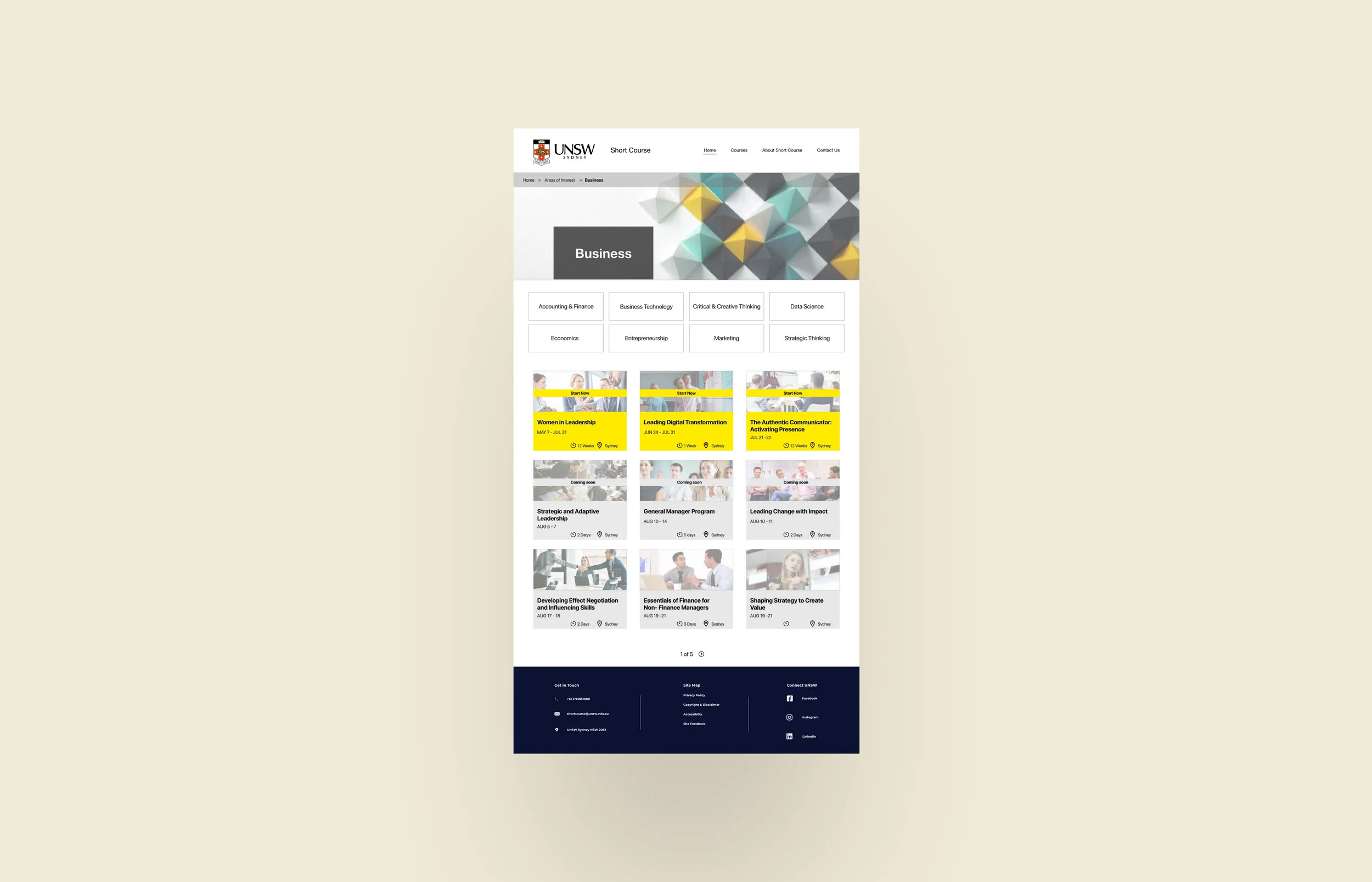
Subcategories within Areas of Interest The original navigation grouped courses too broadly. Based on our card sorting findings, I added a subcategory layer within the Area of Interest section, making it much easier for users to narrow down to relevant courses without wading through everything.
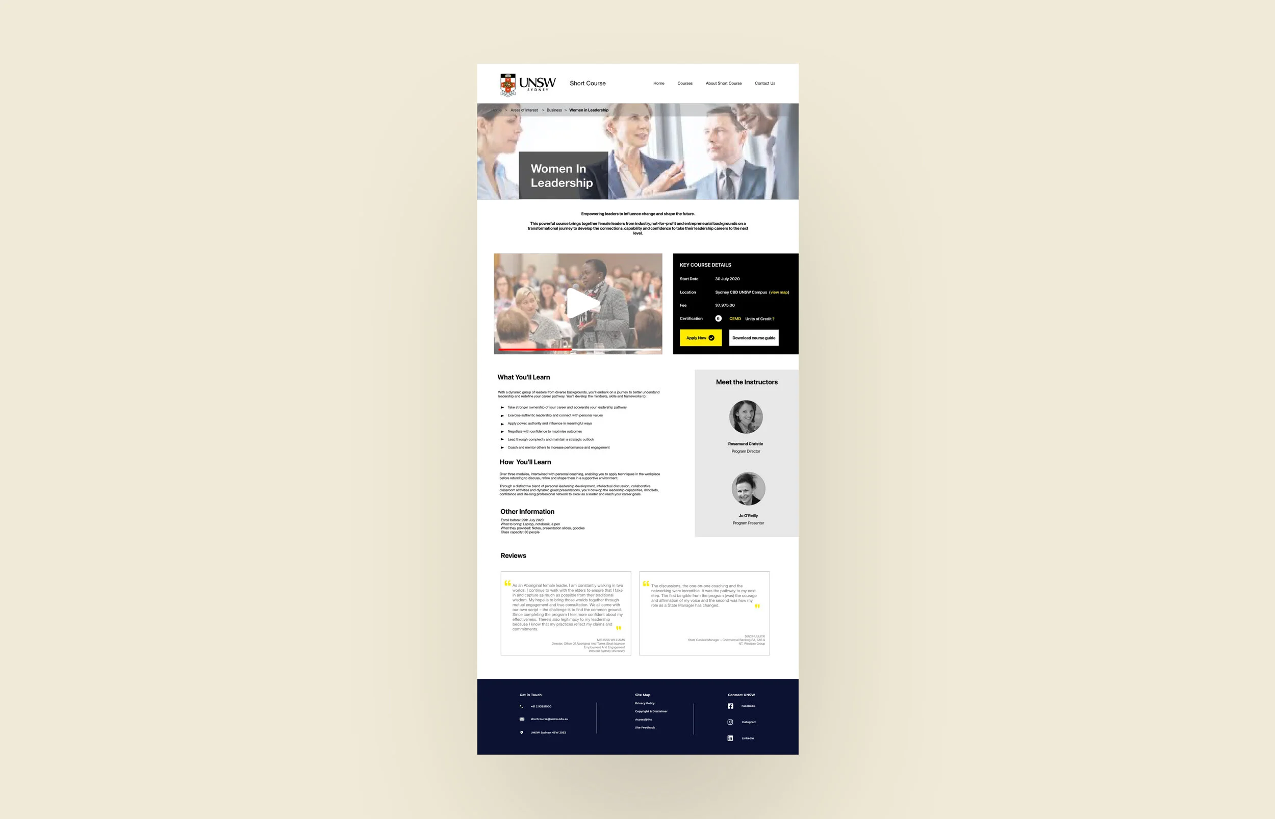
Restructured course detail pages The original course pages scattered key information — price, location, duration, reviews — across the page in a way that forced users to hunt. I consolidated this into a clear, scannable layout so everything decision-relevant was visible in one place.
Clean, professional visual language UNSW is a prestigious institution. The redesigned UI needed to reflect that — clear typography, structured layout, nothing cluttered or inconsistent.
Usability Testing Results
Testing on our prototype showed strong results:
Participants described the experience as clean, simple, and professional
The search bar was described as useful and prominent — people knew exactly where to go
Course content was easy to read, with price, location, and reviews all accessible without digging
The overall enrolment path felt straightforward
Reflection
This project pushed me in ways I didn't fully anticipate. Working in a team of three with a short runway meant we had to make decisions quickly — and we didn't always agree. One of my bigger takeaways was the value of timeboxing design discussions: when you're in a two-week sprint, a 45-minute debate about a layout choice is a problem. I learned to advocate for a position, hear alternatives quickly, and move.
If I were doing this project again, I'd prioritise getting to high-fidelity prototypes sooner. Presenting polished visuals to the client shows effort and makes the vision more credible — even if the final implementation is handled by someone else.