Supporting parents with a platform that builds emotional intelligence
We crafted a UX design solution for a platform that supports emotional intelligence in parenting. By simplifying content and focusing on emotional connection, we helped parents access tools to support their personal growth and relationships.
Overview
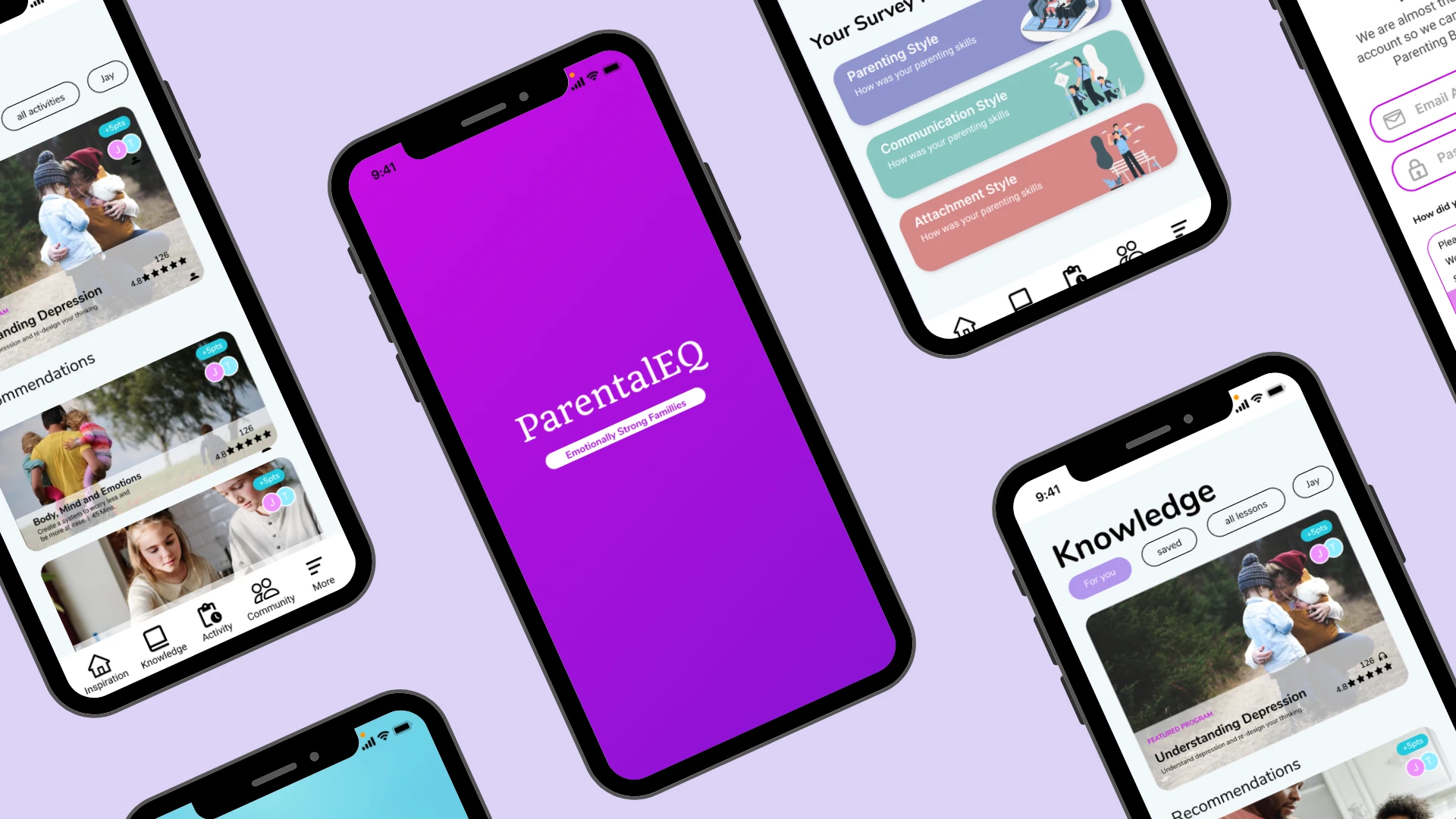
Parental EQ is a digital platform helping parents build emotional intelligence — not through theory, but through structured modules, guided exercises, and interactive activities they can actually fit into daily life.
The platform had solid content. What it needed was a cleaner, more intuitive experience to match it.
The Challenge
Parents are busy. If a learning platform feels cluttered, confusing, or hard to navigate, they don't push through it — they just stop.
Parental EQ's existing interface wasn't doing the content justice. The journey from "I want to work on this" to "I know what to do next" had too much friction. The brief was to refine the UI and overall experience so the platform felt as clear and supportive as the content itself.
My Approach
I was brought in as a UI Designer alongside one other designer, working directly with the founding team in an agile environment. Because we were working on an existing product rather than starting from scratch, the early work was about understanding what was already there before proposing anything new.
Comparative and competitive research: I reviewed how similar platforms — learning tools, wellness apps, parenting resources — handled content structure, onboarding, and engagement. Consistent markers of a good learning experience: clear progress indicators, short-form content chunks, and a strong sense of "what do I do next?" at every stage.
User flows and journey mapping: Before touching the visual design, I mapped the core user flows — from sign-up through to completing a module and returning for the next session. This revealed a few recurring friction points: the onboarding asked for too much too soon, the module structure wasn't immediately clear, and there was no strong re-engagement hook to bring parents back after a gap.
Content strategy: A lot of the friction wasn't just visual — it was in how content was written and structured. I worked on content strategy alongside the design, focusing on making module descriptions clearer, action labels more specific, and progress language more encouraging without being patronising.
Wireframes and prototypes: I moved through sketches and into mid-to-high fidelity wireframes in Figma, iterating in close collaboration with the founding team. Working directly with the CEO, CFO, and COO meant design decisions needed to be explained clearly and connected back to user and business goals — good practice for any stakeholder environment.
User testing and iteration: We ran usability testing to validate decisions before finalising the design. Testing focused on whether parents could find what they needed quickly, understand where they were in the learning journey, and feel motivated to continue.
Key Design Decisions
Breaking content into smaller steps. The original module structure presented a lot of information at once. We restructured it into shorter, more digestible sections — reducing cognitive load and making progress feel more achievable.
Clearer navigation between modules. We redesigned the way users moved between sections so the path forward was always visible and obvious. No dead ends, no hunting for the next step.
Warmer, more human visual language. The platform is asking parents to reflect on their emotional lives and their relationships with their kids. The visual design needed to feel supportive and approachable — not clinical or corporate.
Reflection
Working directly with a founding team is a different kind of design environment. Decisions move quickly, and you need to be able to explain your thinking clearly to people who aren't designers. It pushed me to be more deliberate about how I communicated design rationale — not just showing what I'd made, but why.
The project also reinforced something I think about a lot: in learning platforms, content strategy and UX are inseparable. You can't fix the experience without also looking at how the content is written and structured. The two shape each other.


